📘 Overview
In this test, you will demonstrate your ability to create a responsive web layout using both CSS Grid and CSS Flexbox. This assesses your ability to apply concepts independently, as a front-end developer would in practice.
It is an open-book test so you may consult online documentation (such as W3Schools or MDN) but AI tools are not permitted.
🧩 Files to Create
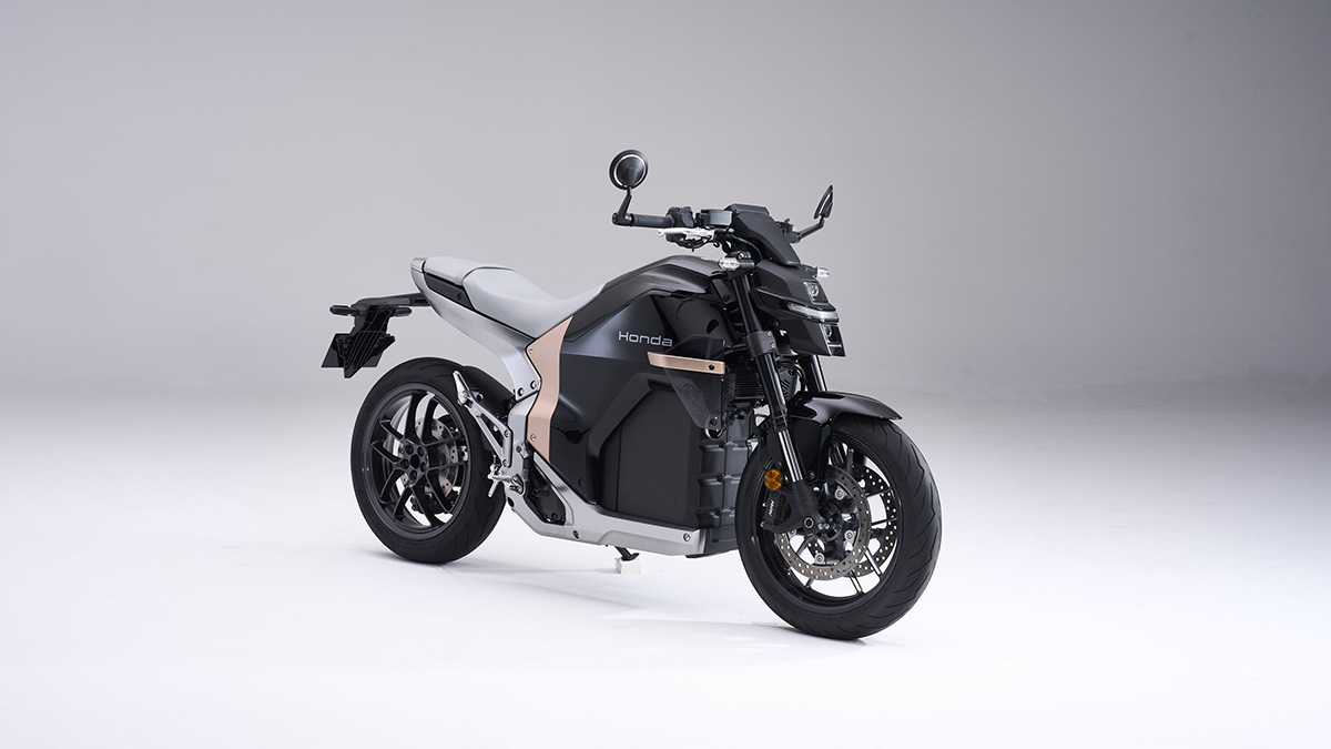
index.html– Main HTML filemain.css– External stylesheetHondaWN7.jpg (used for Task2: Flexbox)–
🧭 Task 1 — Creating a Responsive CSS Grid Layout (60 Marks)
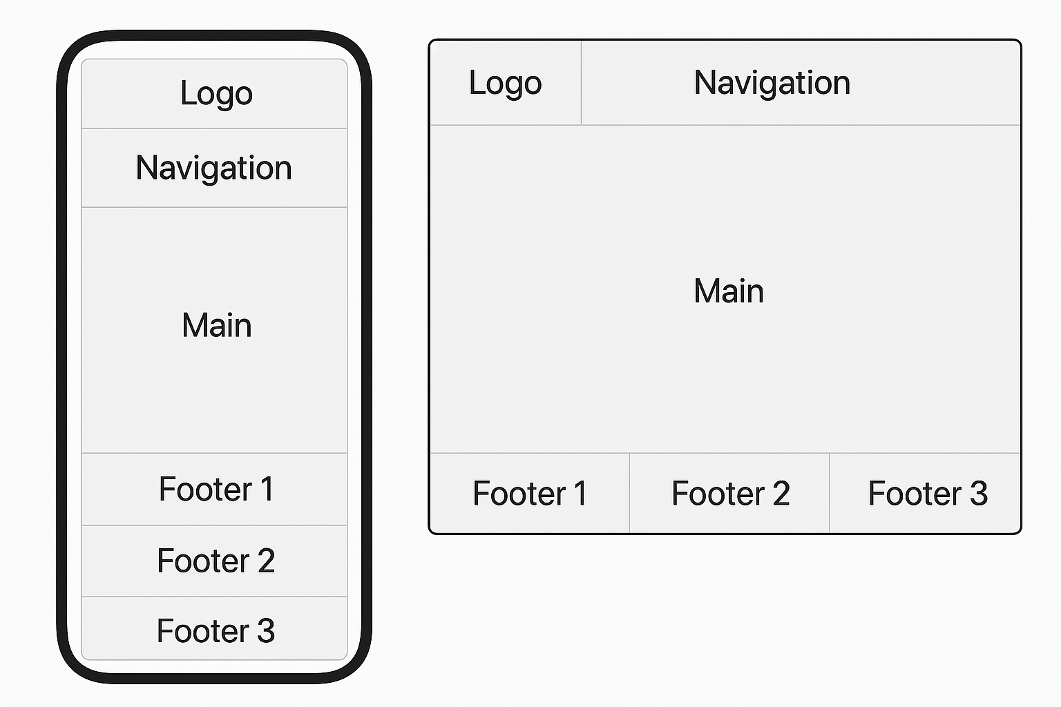
Objective: Create a responsive webpage layout that adapts from a single-column mobile view to a multi-column desktop view using CSS Grid, as shown below.
Requirements
- Use whatever techniques you think are most efficent to create the Logo, Navigation and Main sections.
- Use CSS Grid to structure the footer.
- Keep the page as semantic as possible.
- On mobile (<768px): all sections appear in a single column.
- On desktop (≥768px): Logo and Navigation share the top row, Main spans the full width below, and a three column footer (or 3 footers - depending on how you wish to code it) should go side by side at the bottom.
- Use any combination of
fr,%, orautounits for Grid widths. - Apply minimal styling (background colour, padding, spacing) for clarity.
Marking Breakdown
| Criterion | Description | Marks |
|---|---|---|
| HTML Structure | Correct semantic elements and layout setup | 10 |
| Grid Setup | Proper use of display: grid and column control |
20 |
| Responsive Behaviour | Layout adjusts correctly at 768px breakpoint | 20 |
| Visual Clarity | Readable layout with clear spacing and styling | 10 |
| Total | 60 | |
🧭 Task 2 — Creating Responsive Flexbox Layouts (40 Marks)
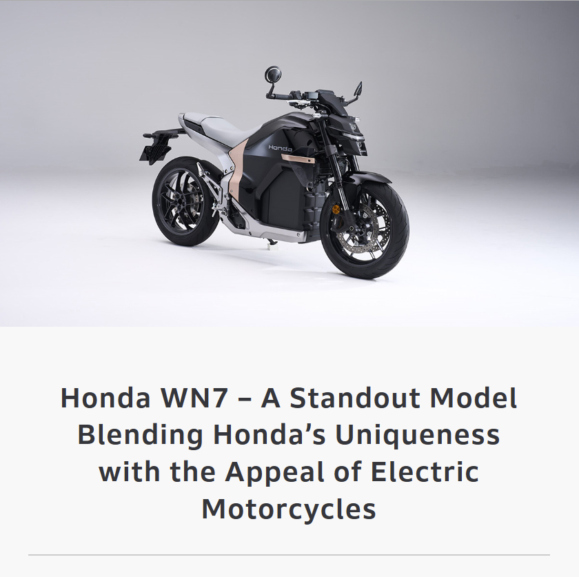
Objective: Inside your <main> section, create
a responsive Flexbox layout using text content and the Honda WN7 image, as shown below.
Layout 1: Mobile Size Screens / Viewports
Layout 2: Tablet and Larger Size Screens / Viewports ≥768px
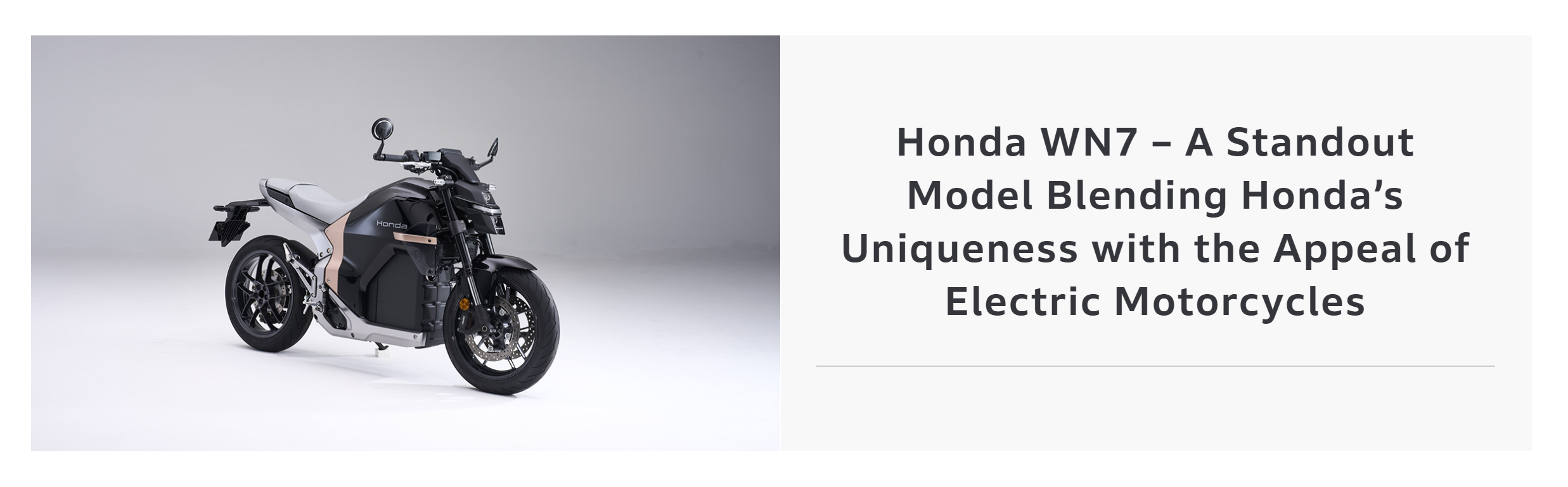
Use the HondaWN7.jpg image provided on above (or your own image if preferred).
Marking Breakdown
| Criterion | Description | Marks |
|---|---|---|
| HTML Setup | Correct use of sections, headings, and image | 10 |
| Flexbox Layout 1 | Accurate use of Flexbox and responsive change | 10 |
| Flexbox Layout 2 | Correct reverse ordering and responsiveness | 10 |
| Visual Clarity | Consistent alignment and spacing across devices | 10 |
| Total | 40 | |
🧾 Submission Instructions
- Test your layout by resizing your browser window from mobile to desktop width.
- Upload your files in a zipped folder Brightspace under “Test – Responsive Layout (Grid + Flexbox)”.
- Include
index.html,main.css, andHondaWN7.jpg.