Lab 4: CSS Responsive Grid - Test Your Knowledge
CSS Grid Layout Realworld Example
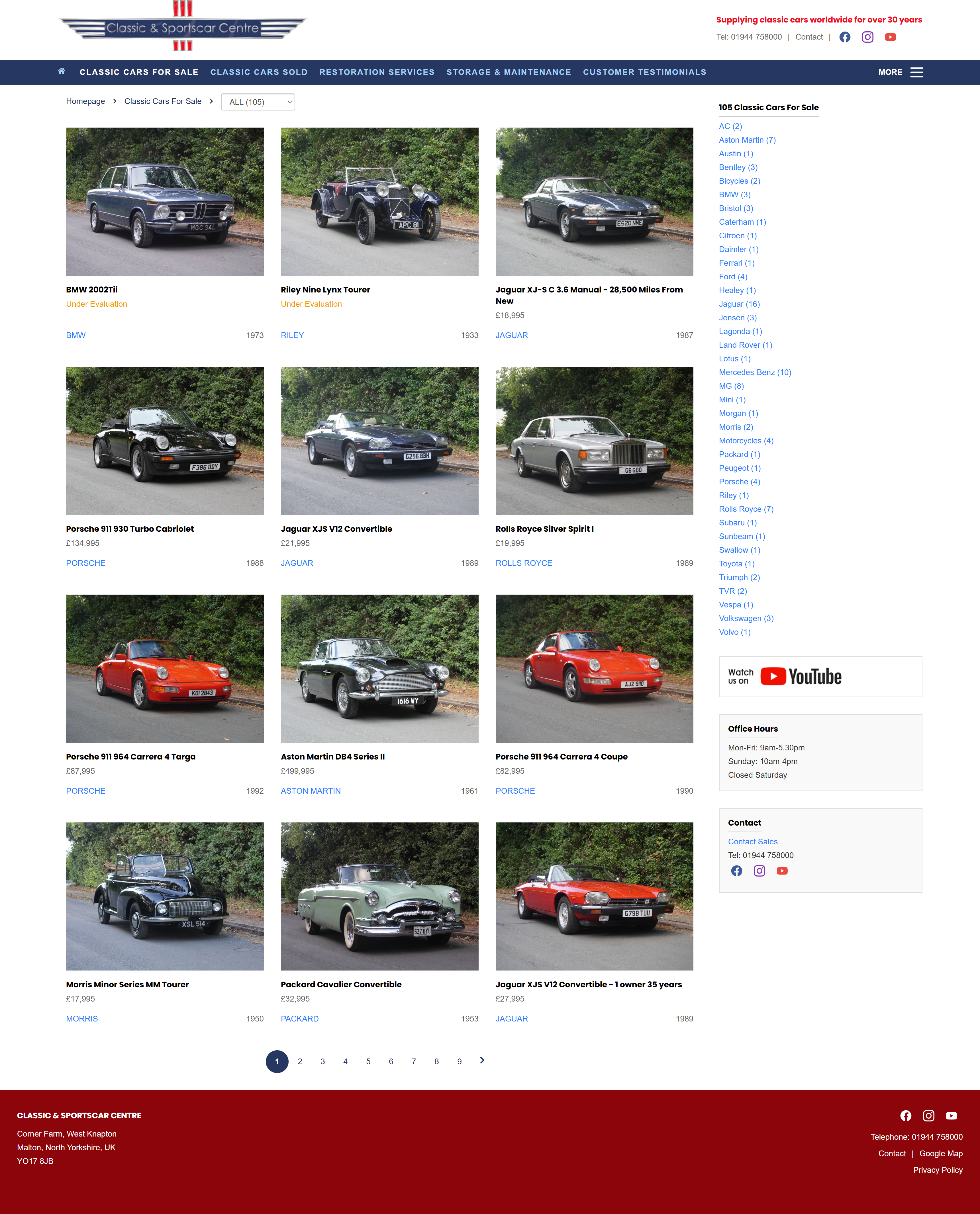
The below screenshots have been taken from https://www.Classicandsportscar.ltd.uk
The below screenshots have been taken from https://www.Classicandsportscar.ltd.uk


Recap: A 'viewport' is the user's visible area of a web page, which is determined by the size of the browser window.
Recreate the image gallery from the screenshots above. You don't need to create the navbar, side menu, footer or any other elements besides the car photo gallery and accompanying text. Use a responsive CSS grid layout with media queries. You can use placeholder images from any source.
Recap: A 'breakpoint' is a specific point in the CSS where the layout changes based on the viewport size. See notes on responsive design for more information.
Everything you need to know is in our previous labwork on Responsive CSS Grid Layouts. The main difference is the approach to styling for different screen sizes, and how to implement the text to the right hand side for mobile viewports. However instead of percentages, you could use fractions. See below.
Remember to test your layouts at each breakpoint to ensure they are working as expected.
fr Unit
The fr unit is a fractional unit, an input that automatically calculates layout
divisions when adjusting for gaps inside the grid.
fr unit allows you to define grid tracks as fractions of the available space.1fr each, they will each take up an equal amount of space (25% each).